Airport Brand & Web Redesign
Cabo Frio Airport
My role
UI/UX Designer
Keywords
UI/UX Design, Design Tokens, Brand Integration, Cross-Functional Collaboration, Web Design
Briefing
Why did the client choose us
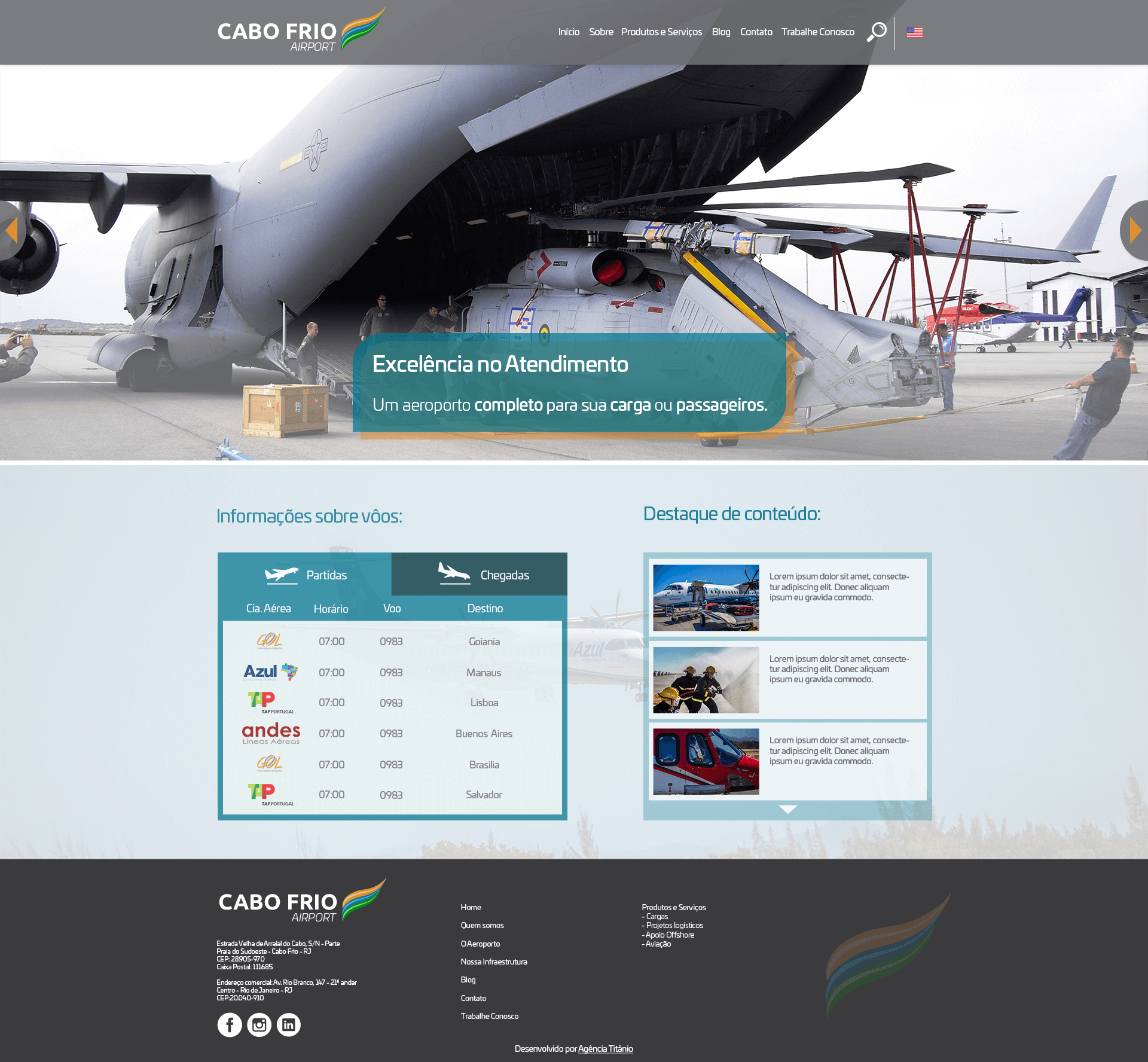
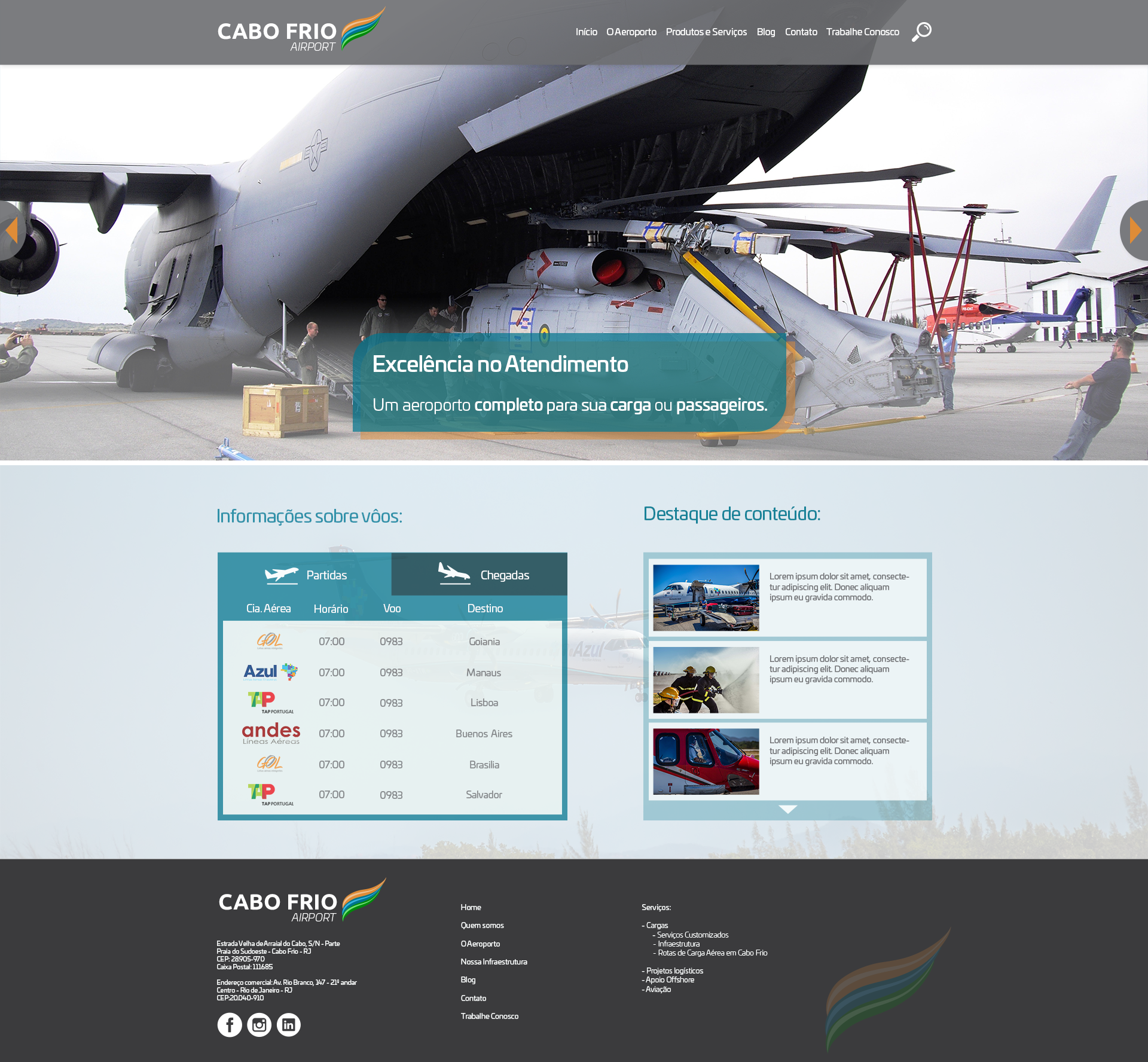
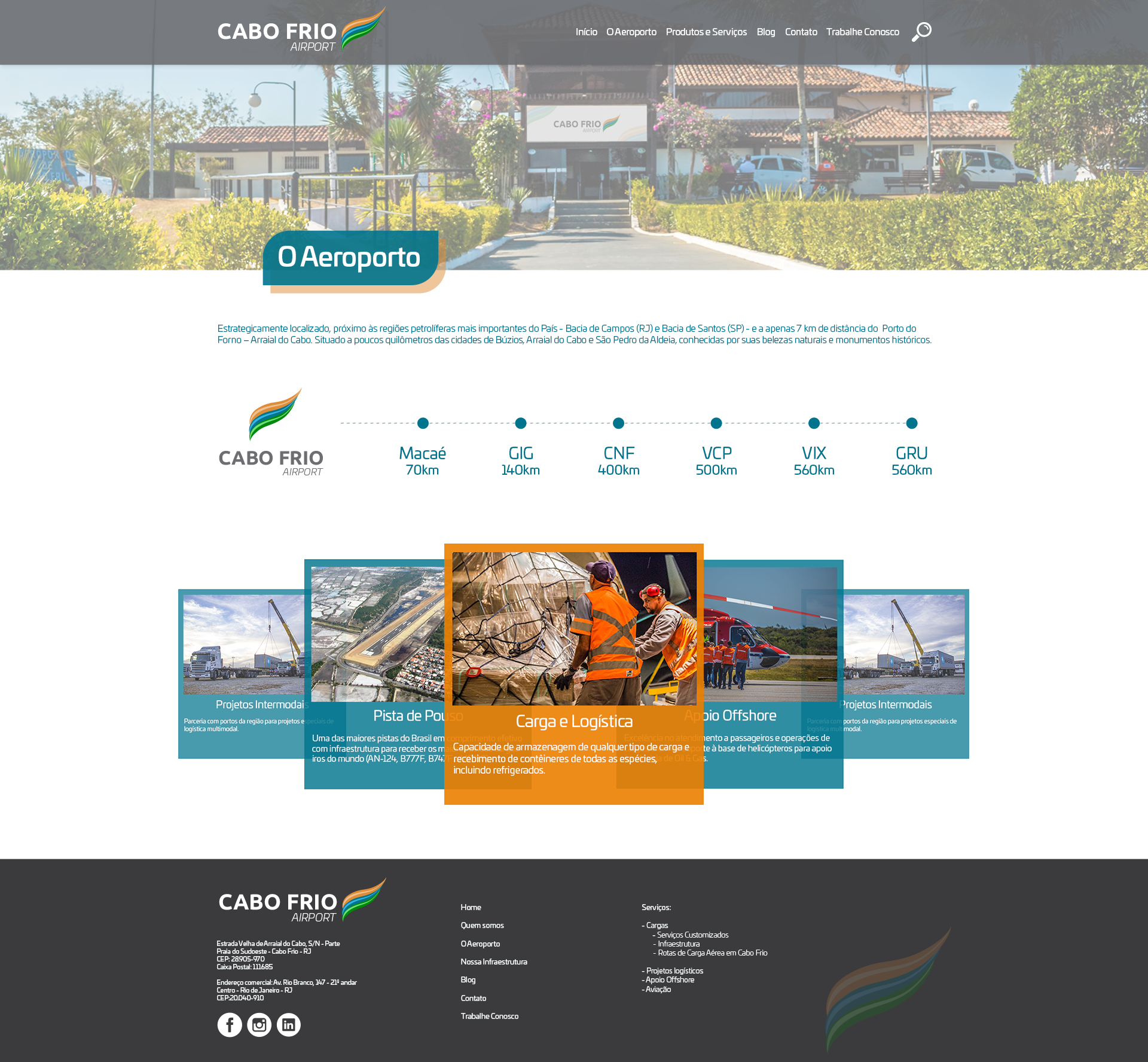
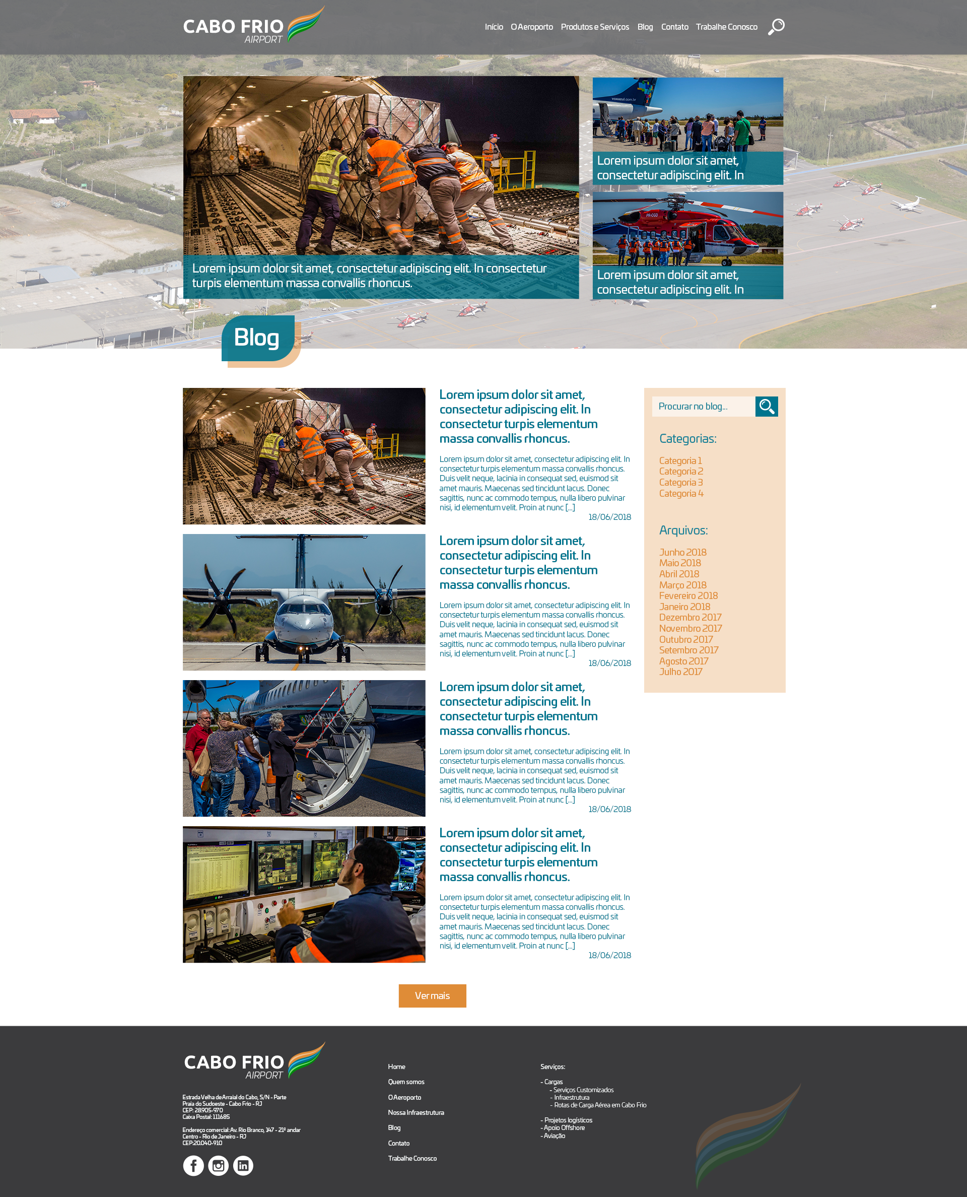
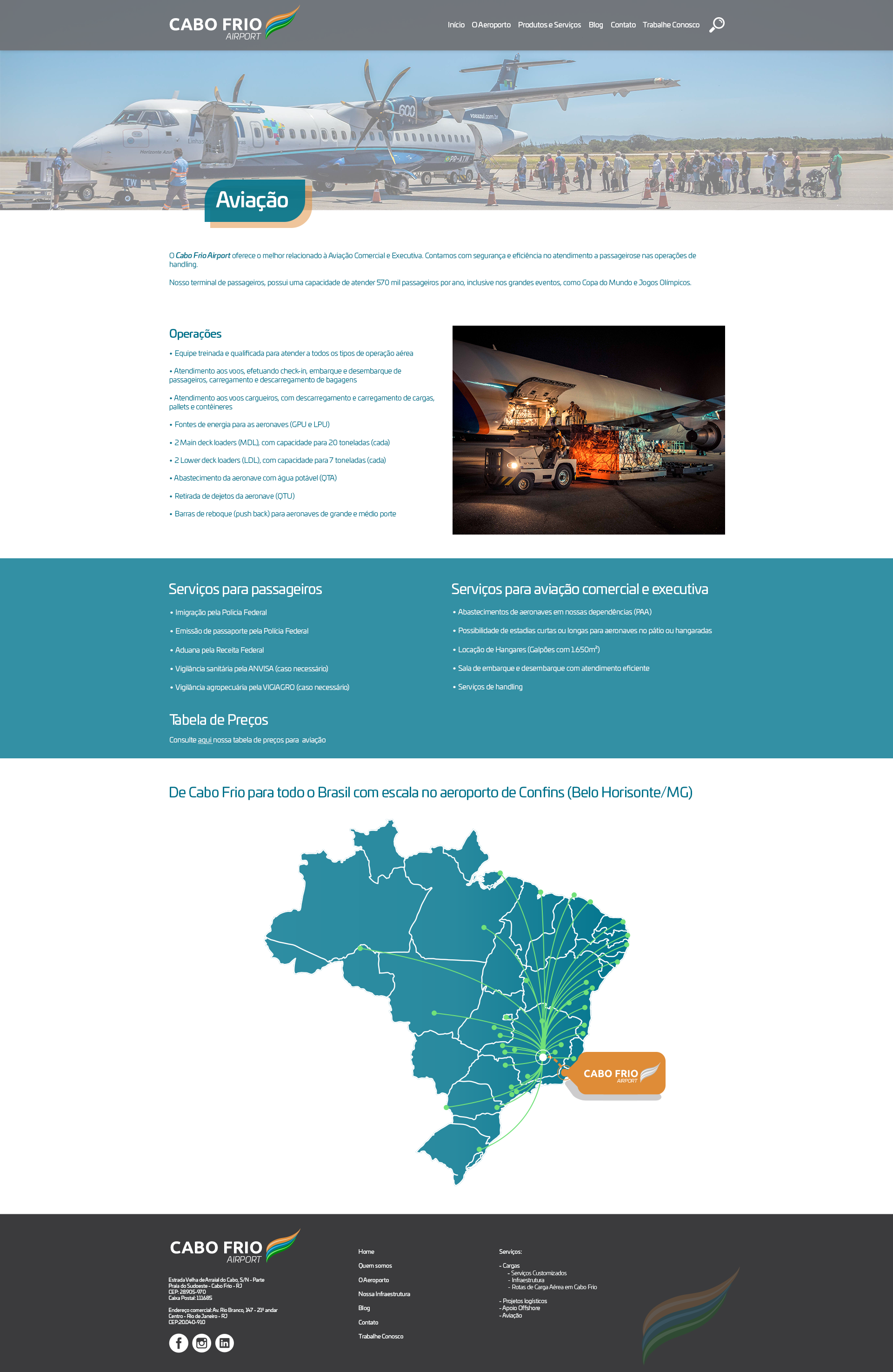
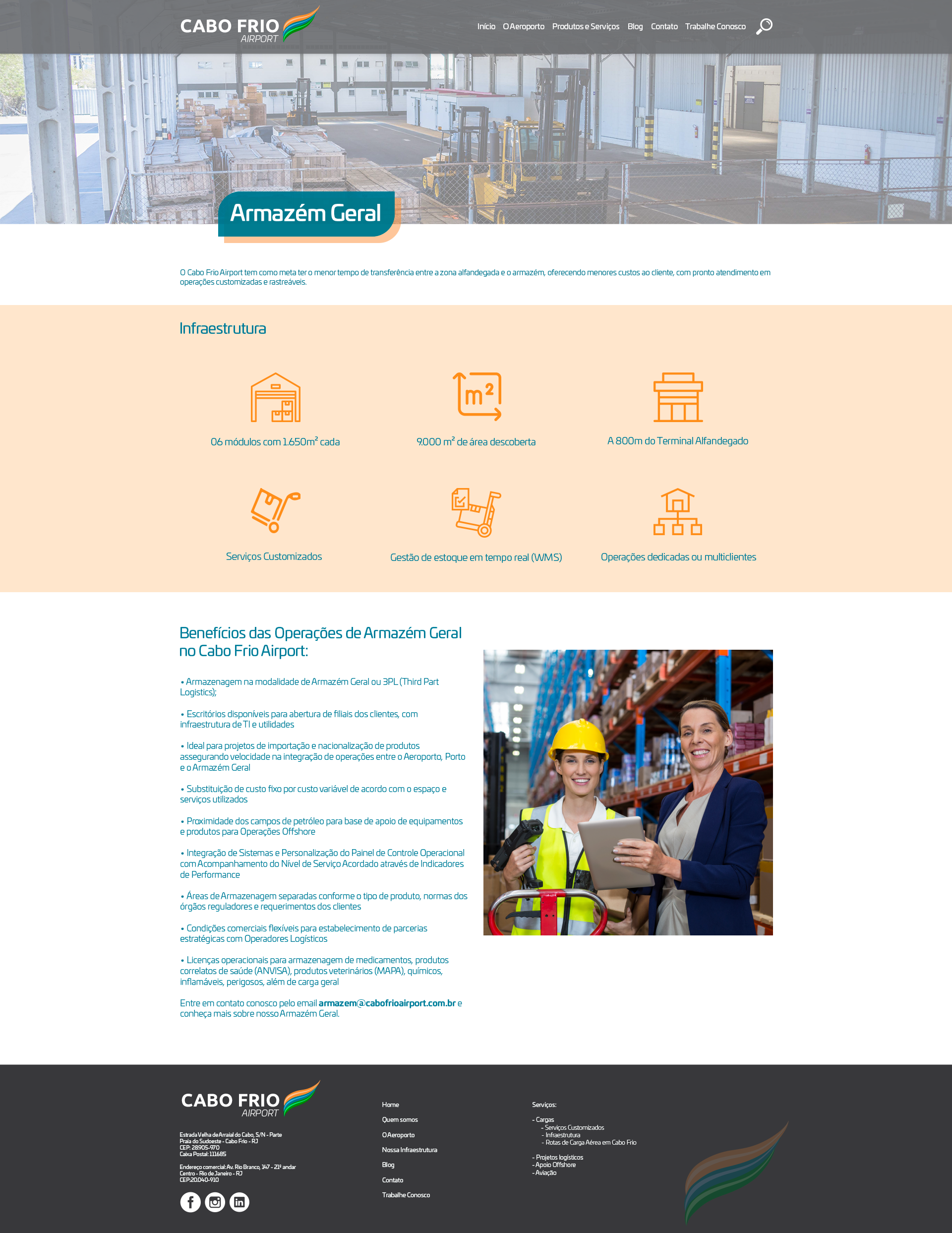
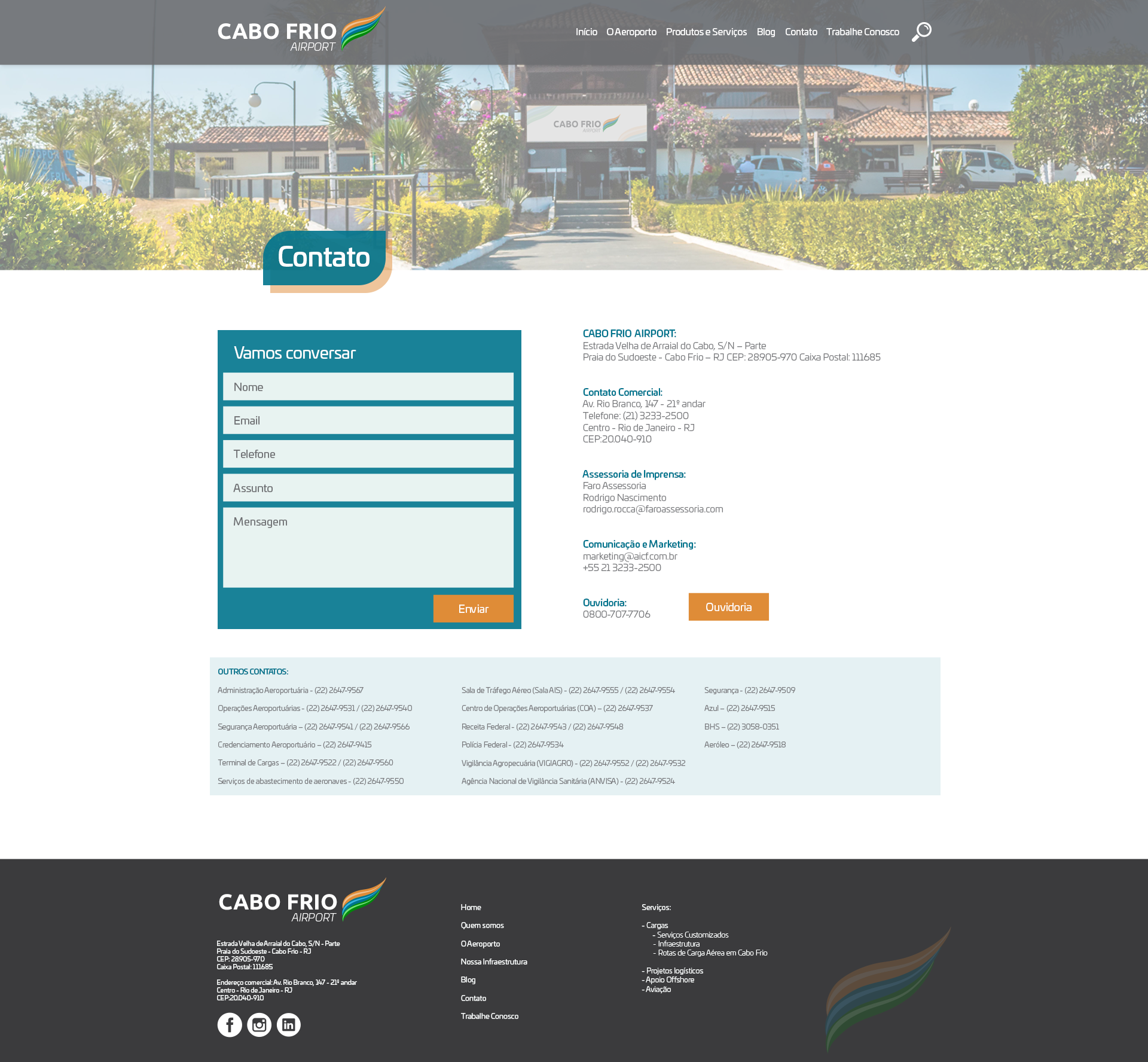
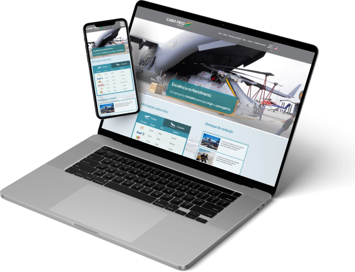
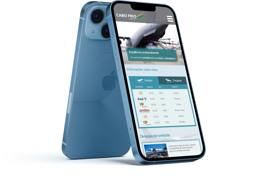
Our challenge was to create a completely new and content-rich website that portrayed the company’s new brand, market positioning and personality, in order to make them an internationally strong brand.
My role and the team
Responsibilities/ Client expectations/ Collaborations
I was the designer responsible for this project and collaborated closely with the marketing and customer relations teams to get feedback and iterate on the deliverables before presenting them to the client.
Methods
Toolset/ Insights/ Methods/ Achievements
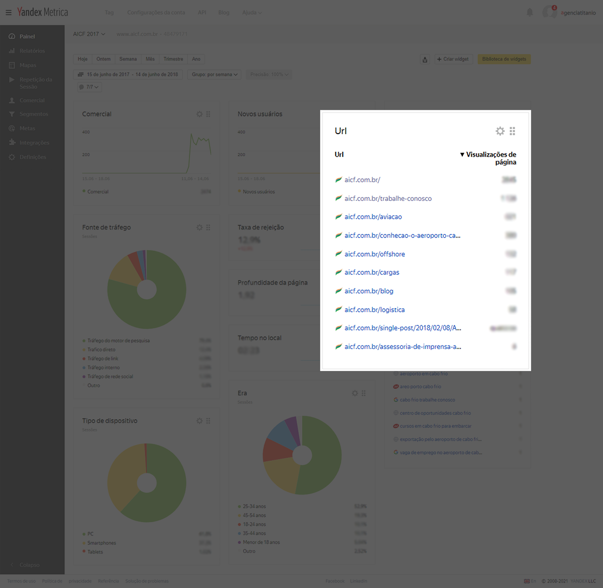
As we were already managing the previous website, we were able to keep a metrics script running for some time, gathering good usage data. That data helped us to find out what the average user wanted to see on the website and along with the input of the shareholders’ needs, helped us create the persona.
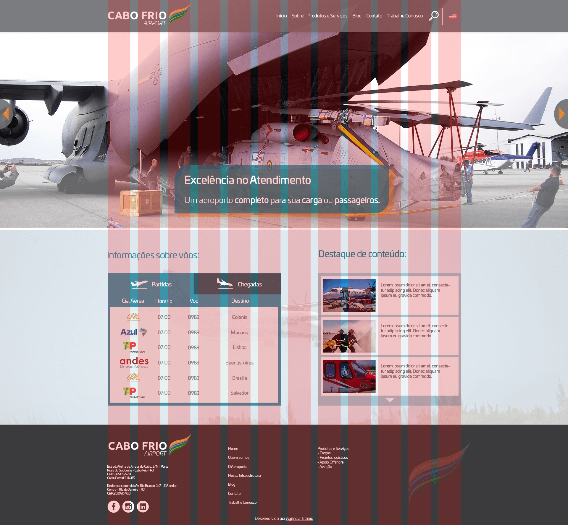
We chose to create the website following a 12 column grid – spanning 1200px centred on the 1920px width – to simplify the development by using the Bootstrap framework.
Challenges
Iterations/ Changes/ Decisions/ Abandoned ideas
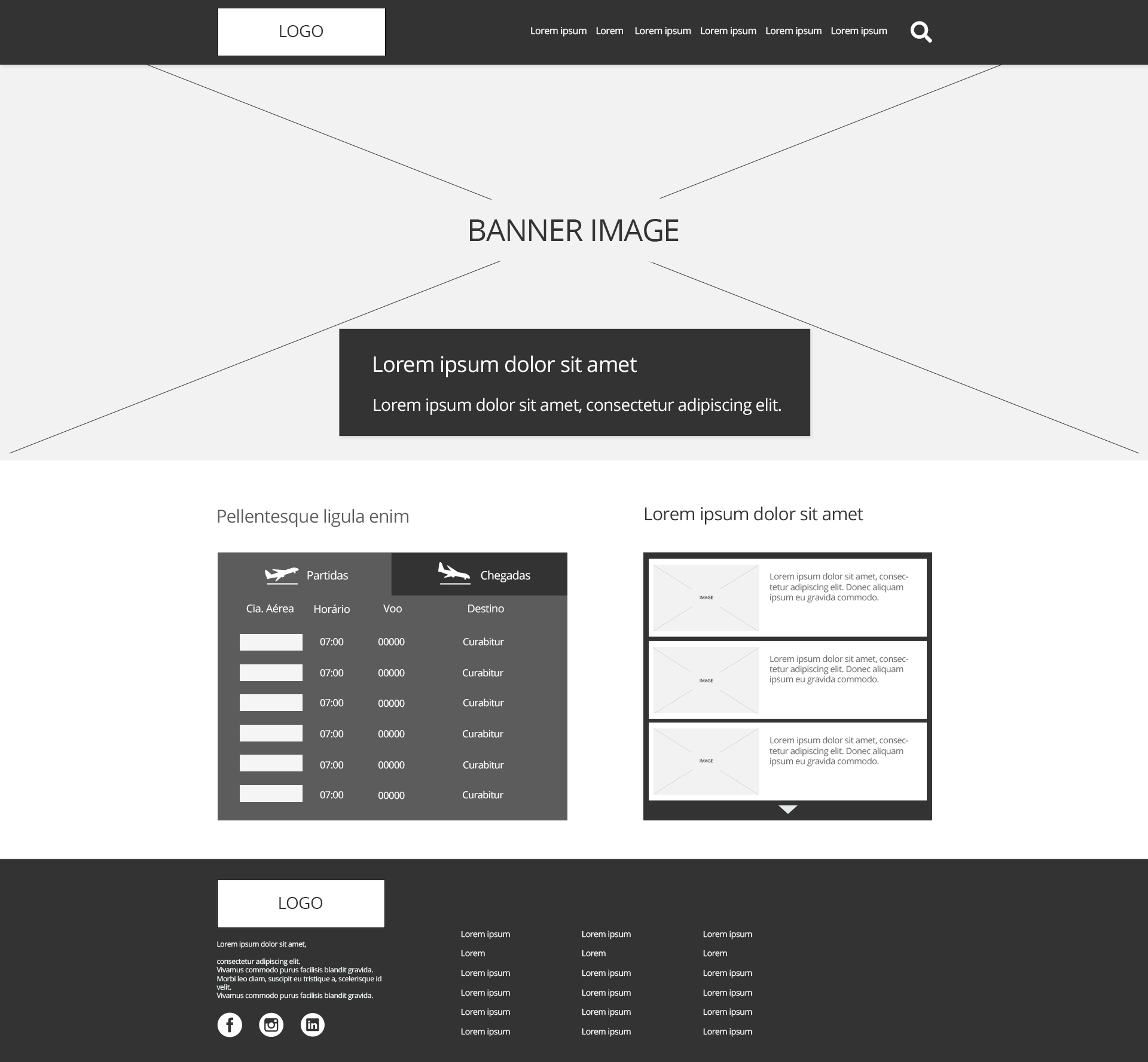
Their main need was to showcase all the different services they provide in a way that was easy to understand and visually appealing. One idea we needed to abandon was the services shortcut bar under the top banner. We backed the idea with the data from the metrics script, showed the shareholders that these shortcuts were for the most viewed pages and that it would help the users reach the content they wanted more efficiently but unfortunately, the shareholders did not agree with us and we had to leave this feature behind.

Style Guide
Colour Palette
Typography
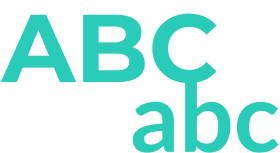
We decided to use sans serif fonts to bring a modern feel to the brand and to detach from the previous parent company that uses a more traditional serif font.
Conclusion
Lessons learned
Throughout this project, I learned to be less attached to the alternatives created and to understand better how to sort out what are the relevant remarks from different people on the client team, since we can’t address them all because in many cases they are conflicting with one another or with the project briefing. I also learned that sometimes we have to let go of good ideas that would improve the users’ experience because the client wants to prioritize something else.
